So, what do great 'Contact Us' pages look like?
Typically, the best contact pages ...
- Are easy to find so a visitor can quickly get in touch should they need it.
- Explain why someone should contact them, and describe how they can help solve their visitors' problems.
- Include an email and phone number so visitors can quickly find the right information.
- Include a short form using fields that'll help the business understand who's contacting them.
- Include a call-to-action to keep people on their website -- and provide them with another option if they don’t want to complete the form.
- Showcase the company's thought leadership, whether that's by including a list of recent blog posts or articles about the company in the press.
- Link to active social media accounts like Twitter, Facebook, Instagram, and LinkedIn to give visitors a way to engage with the business.
- Redirect to a thank-you page that explains when and how you'll be contacting them.
- Are creative and memorable so visitors associate contacting your brand with a positive or funny memory.
- Show off what your brand does so visitors and possible customers can get a sense of the work you do before they even get in touch.
Ready to get inspired? Below, we've curated 21 examples of some of the best 'Contact Us' pages out there. Check 'em out -- and think about how you can incorporate some of these ideas into your own contact page design.
21 of the Best 'Contact Us' Pages
There's a lot going well for Tune's contact page: the beautiful design, the calls-to-action, the clearly displayed contact information, and the form below the fold for visitors who want to get in touch with specific inquiries.
What I love the most about their page, though, is how welcoming they are. With copy like "We're ready to lead you into the future of mobile marketing" and "Get in touch with us," it makes visitors feel like they're being taken care of. Many business' contact pages are rather cold -- but the more friendly you make your page's copy, the better you'll make your visitors feel. After all, you should want them to contact you so you can help them and start building a relationship.
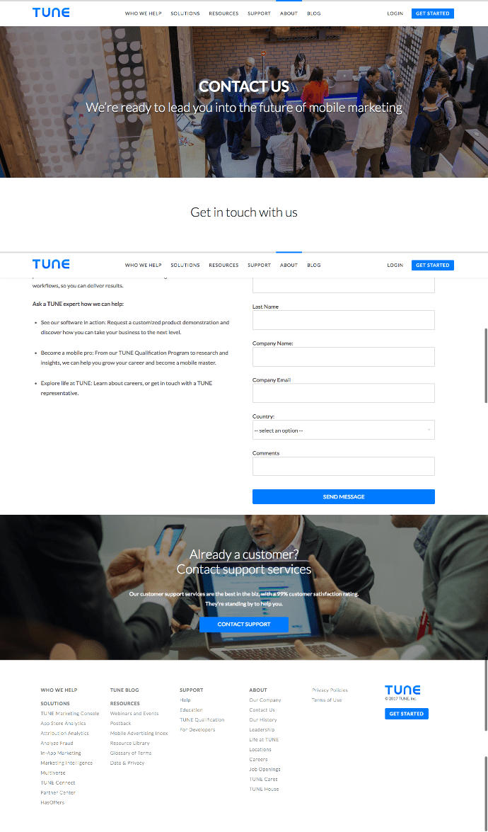
[View the full 'Contact Us' page here.]
Like many businesses out there, Achieve3000 has a lot of different types of people visiting their website -- and what these people want to contact them about can vary widely. That's why they've decided to go deeper than the one-size-fits-all approach.
Below that nice hero image and a few words explaining what visitors will get when they contact them, you'll find three options: You can request a demo, you can reach out to a sales rep, or you can get in touch with customer support. Each one of these options leads to a separate landing page, like the one I've included below this screenshot. What a great way to cater to the most common needs of your various web visitors.
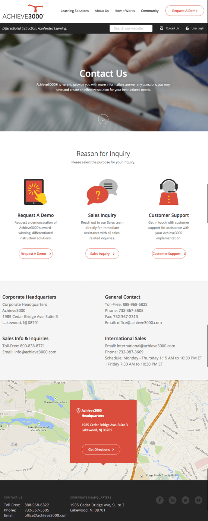
[View the full 'Contact Us' page here.]
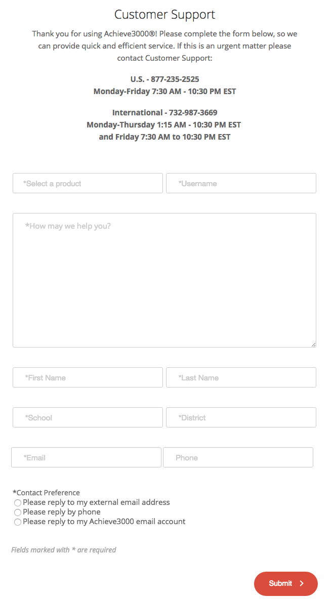
Here's the landing page form made specifically for customer support inquiries:
Hands down, the best thing about Choice Screening's 'Contact Us' page is their copy. It doesn't get much better than this -- all starting with that concise, delightful "Talk to a Human" header.
Following all that great copy is a well-organized page with contact information including emails for every different department, followed by a form. The form's a little lengthy for most businesses, but for a business that runs background checks of all kinds, the form fields are likely necessary to help them organize all their inquiries.
When considering how long your own forms should be, think about whether you'd rather have more inquiries coming in, or higher quality inquiries coming in. As long as you have other, easier avenues for folks to contact you, a longer form can be OK for some businesses.
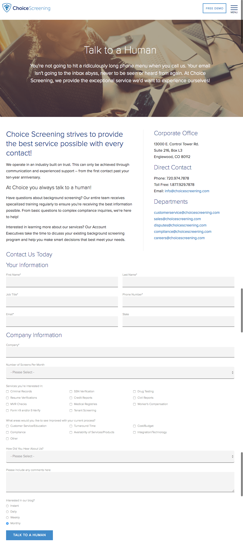
[View the full 'Contact Us' page here.]
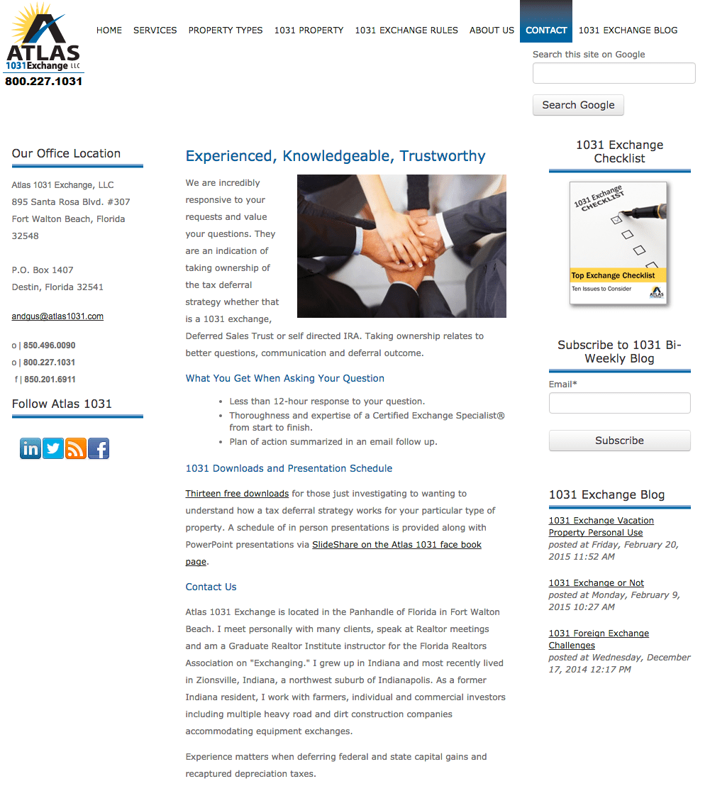
At first glance, Atlas 2031 Exchange's contact page doesn't have the sexiest of designs. But when you look closely, you'll realize that it has every single aspect of a great 'Contact Us' page -- and that starts with functionality.
The page explains thoroughly how responsive they are to questions: "We are incredibly responsive to your requests and value your questions." Then they actually list out what people will get when they ask a question, including a promise for a short response time of 12 hours or fewer. The page also includes easy-to-read contact information, social media buttons, links to offers, and even a list of recently published blog posts. Well done.
[View the full 'Contact Us' page here.]
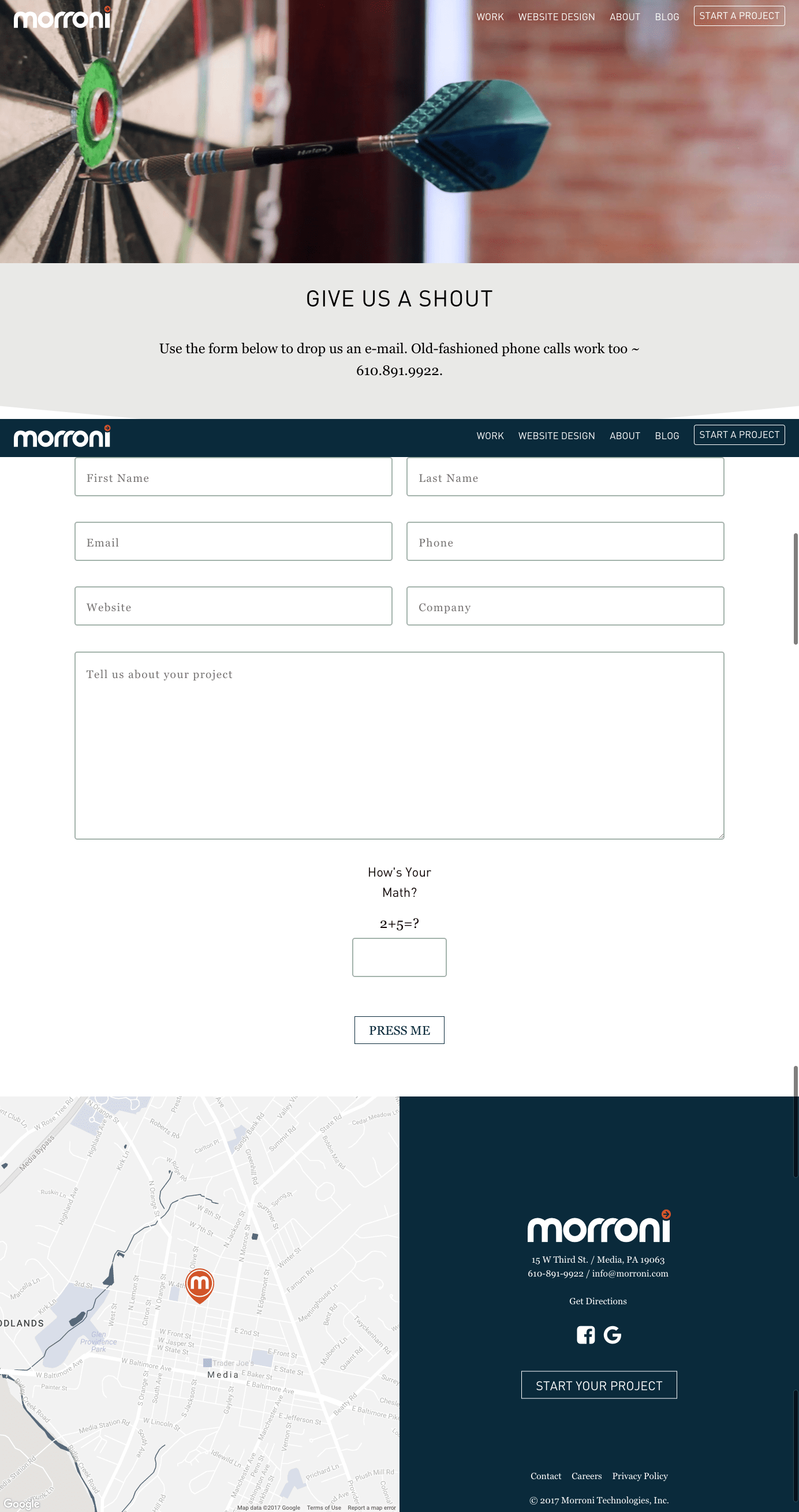
Let's be honest ... these days, most people would much rather fill out a form than get on the phone and talk to someone. When choosing what to ask people in your forms, make sure you choose ones that'll help your specific business understand the person contacting you -- and even help you qualify them as a potential lead.
Of course, some people do like picking up the phone ... hence the delightful quip before the phone number. We also like Morroni'schallenge-response test to figure out whether visitors are human: "How's your math? 2+5 = ?."
[View the full 'Contact Us' page here.]
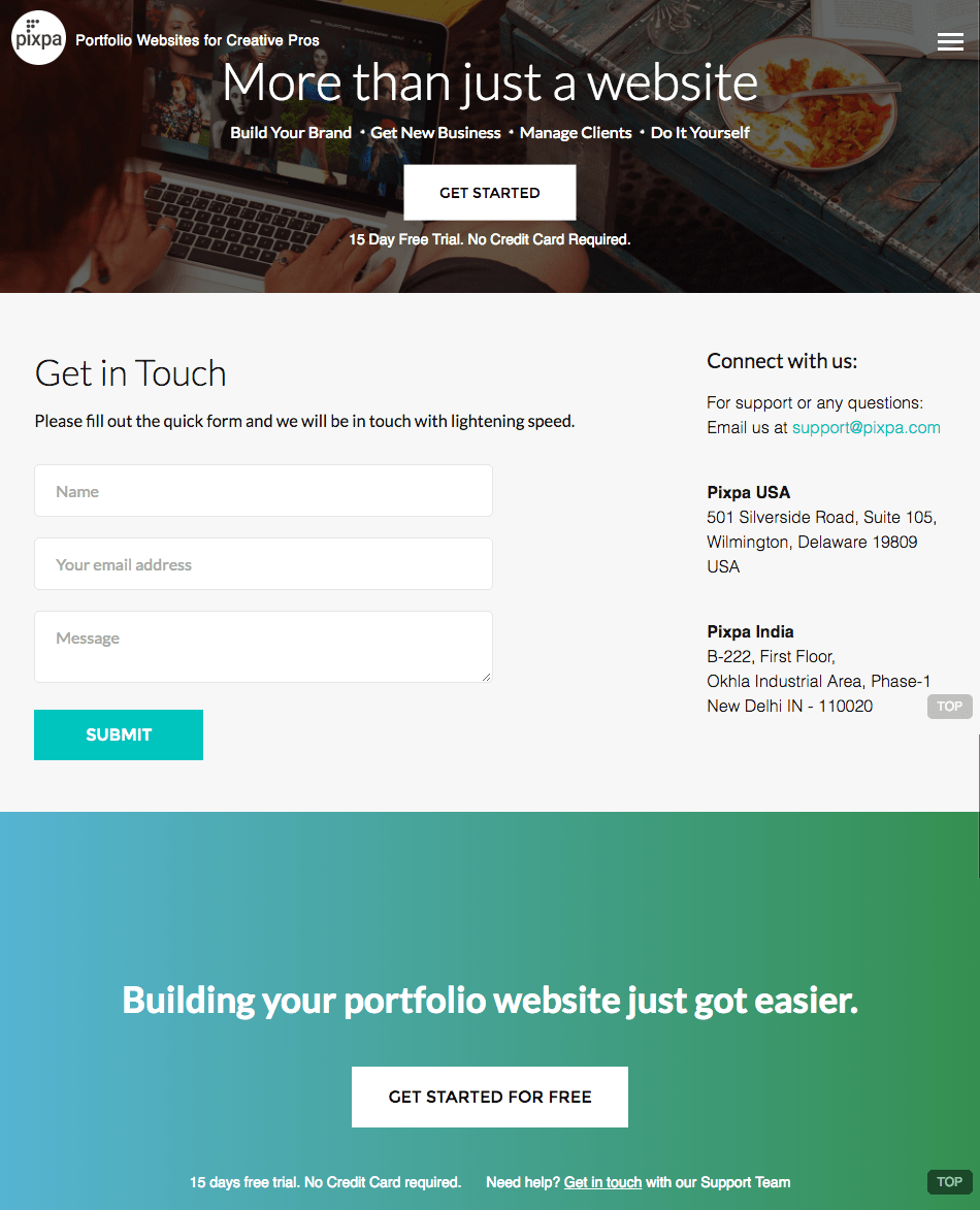
You'd be surprised how many 'Contact Us' pages don't include a call-to-action. Although the main purpose of your contact page is to help people get in touch with your company, there'll always be folks who land on the page and don't want to fill out the form. That's where a little secondary CTA can fit in nicely.
It can be as simple as a button leading to your blog. Or, it can lead people to demo your product, download a how-to guide, or watch a video. The folks over at Pixpa chose to add a CTA at the bottom of their 'Contact Us' page for a free trial. That way, they're providing value to the folks who land on the page and really just want to talk to a sales rep directly.
[View the full 'Contact Us' page here.]
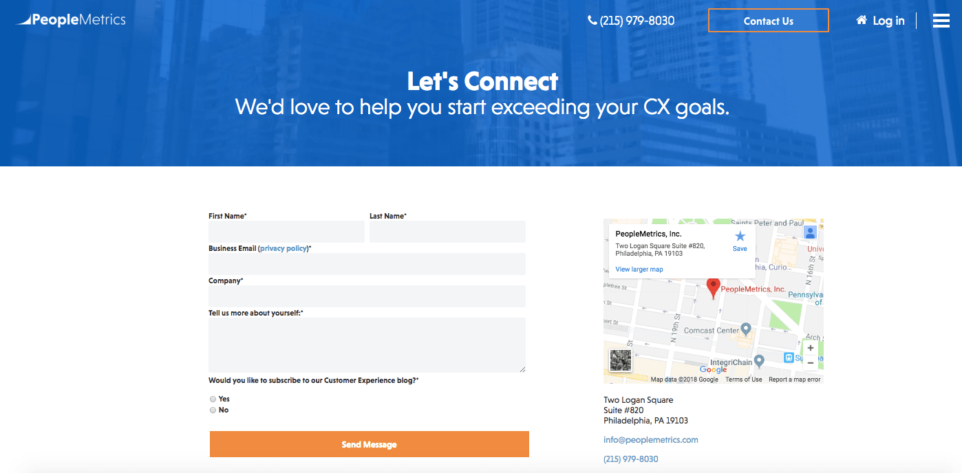
Sometimes, the simplest approach is the best approach. PeopleMetrics' contact page is clean, well written, and does exactly what it's supposed to do. They know that most of the people who land on their contact page are scanning for the easiest and best way to get in touch, so they didn't let any heavy design get in the way.
To make people's lives even easier, they let you use your Facebook or Google Apps login, shortening the conversion path even further. Plus, we think it's clever to include an option to subscribe to their blog at the same time as they submit a request.
[View the full 'Contact Us' page here.]
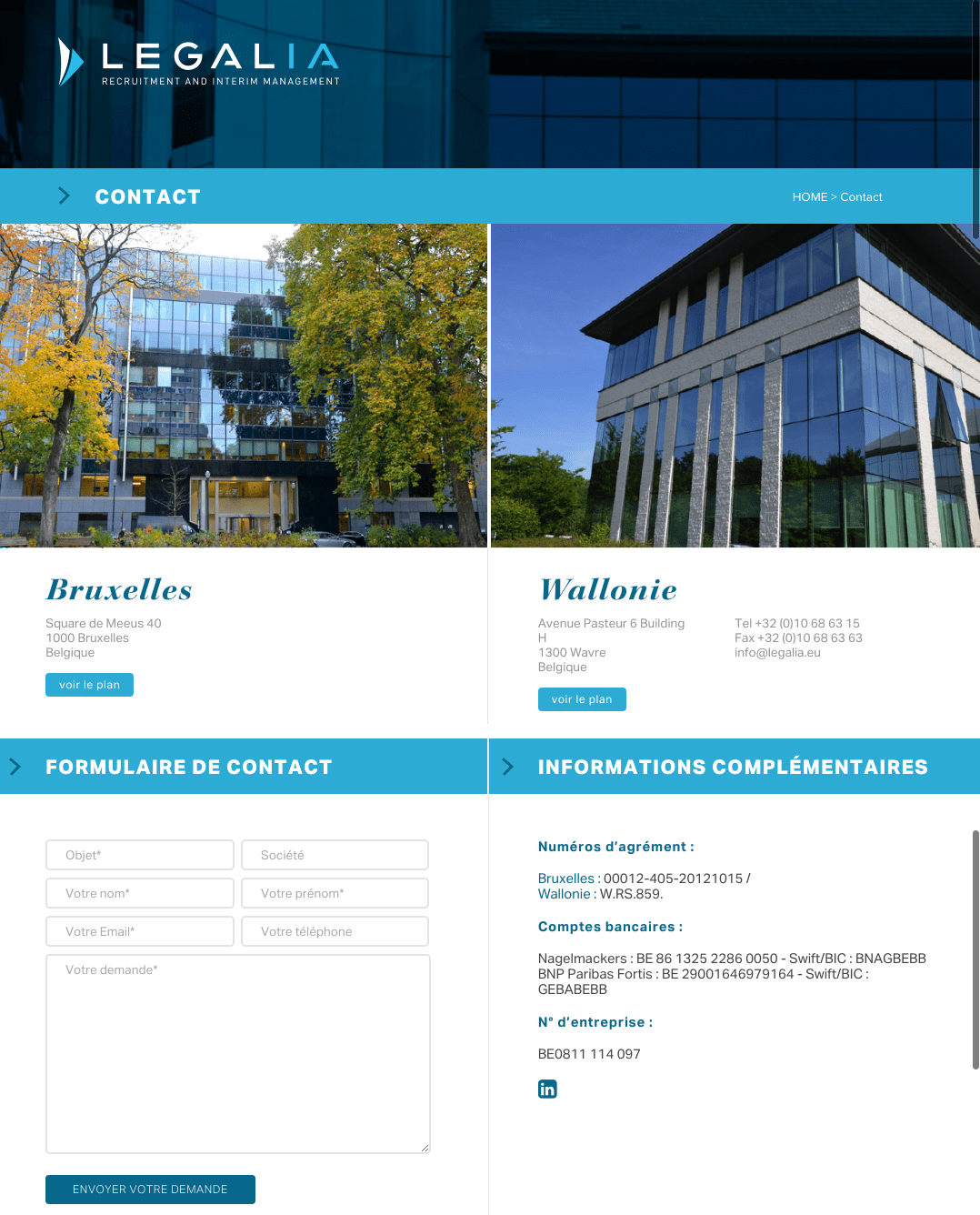
Here's another contact page with a clean, functional design. All the information you need to know, including a short form, is consolidated into a smaller space that doesn't feel crowded. One way they accomplish this is by changing those large images of the building into maps of the locations -- which you can do by clicking the "voir le plan" ("view the map") button below the address.
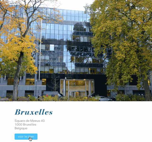
I'd also like to point out a small but important detail for businesses who have international customers. Check out how Legalia included the prefix for their country's code when listing their contact phone number. Many people overlook this if they aren't used to dialing international prefixes themselves, but it's really helpful for your international colleagues and clients to have it right on there. Here's a list of country codes if you don't know yours.
And here's what the whole page looks like:
[View the full 'Contact Us' page here.]
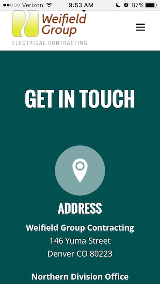
With the continuing rise of mobile web browsing and Google heavily favoring mobile-friendly websites on their search engine results pages, it's important that all pages on your website -- including your 'Contact Us' page -- are mobile-friendly.
This includes simplifying your navigation, keeping forms short and sweet, including large CTA buttons that are easily clickable with a thumb, and large form fields that make it easy for folks to fill it out on their mobile devices instead of having to pinch and zoom.
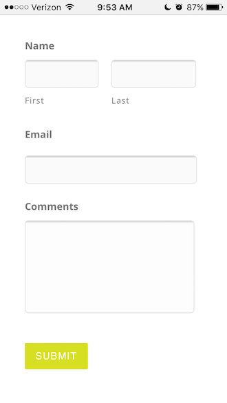
The Weifield Group's contact page is a great example of one that is mobile-friendly and responsive. Check out the desktop version of their contact page first, followed by their contact page on mobile -- and note how they've optimized every part of their page for mobile. The text is large, the form fields are easy to fill out, and their CTA button is large and easily clickable, making for a much more seamless mobile experience.
Here's the desktop version:
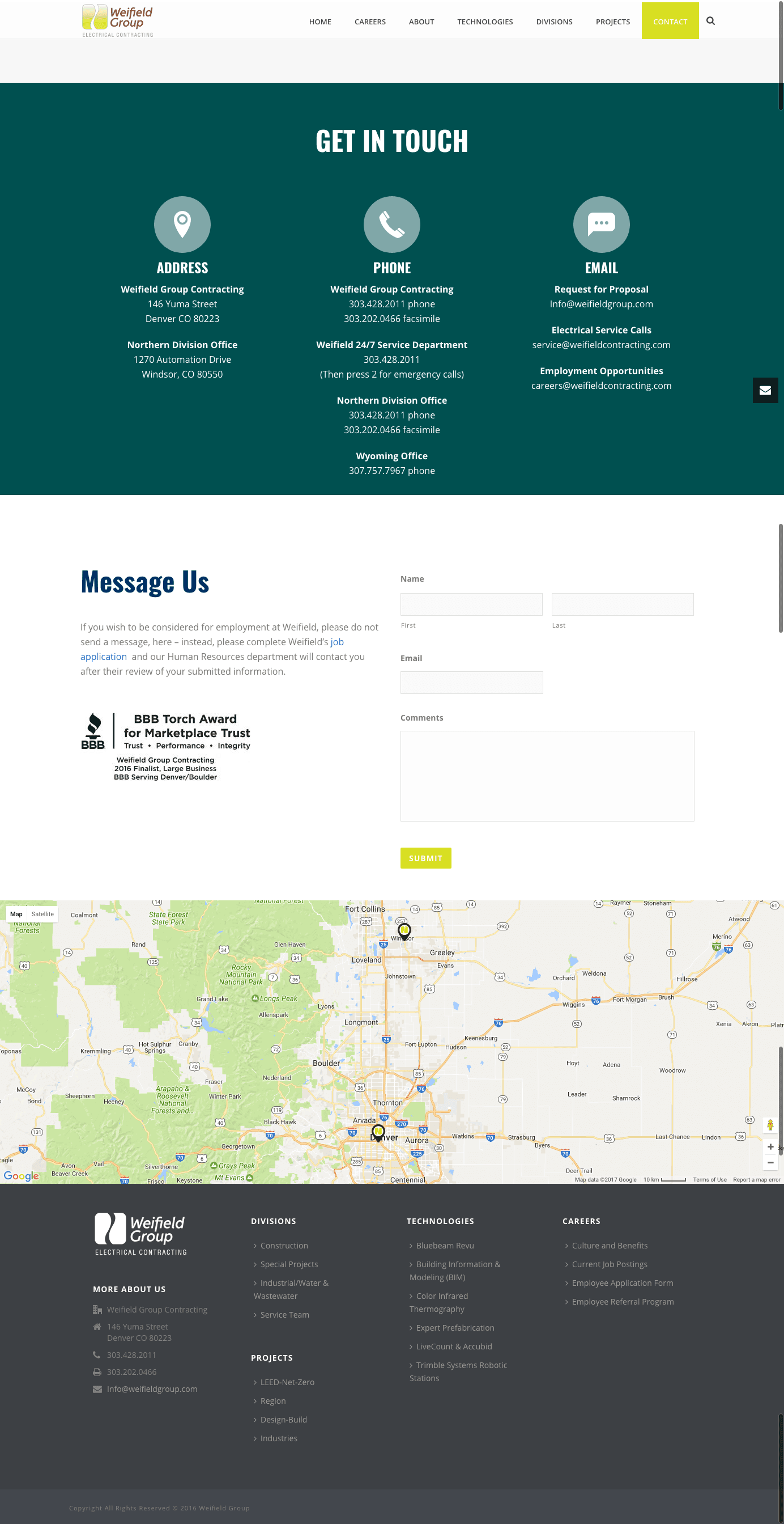
[View the full 'Contact Us' page here.]
And here's the mobile version:
HubSpot Customers: If your website is on the Content Optimization System (COS), then your site is already mobile-friendly from a technical point of view. The HubSpot COS uses responsive design to adapt to any mobile device and fully passes the sniff test on Google's new algorithm.
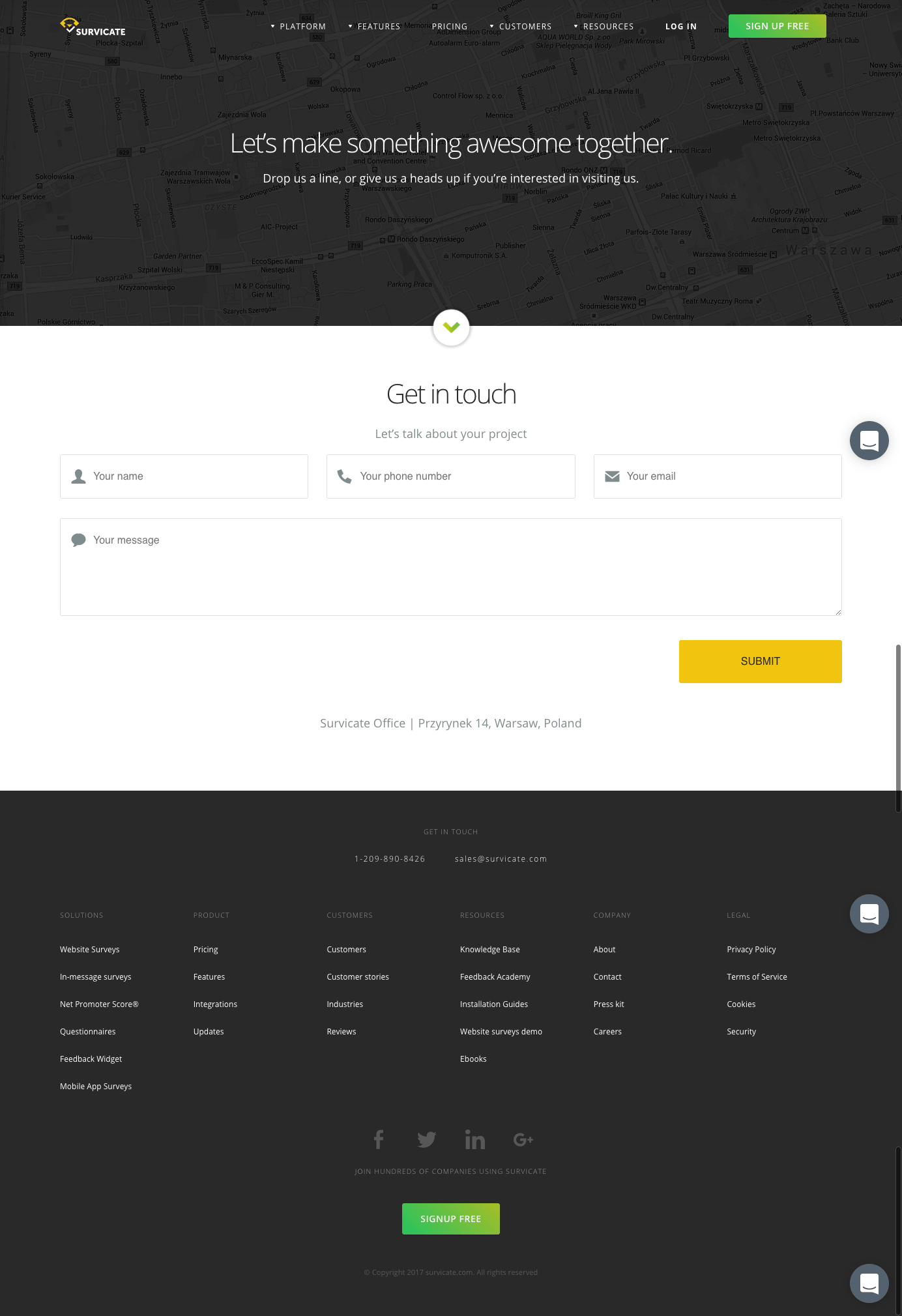
Survicate's contact page is another example of a beautifully simple layout combined with friendly, welcoming copy. I love the subheader below the fold and just above the form, which reads: "Let's talk about your project." That kind of conversational, colloquial language is exactly the kind of copy that makes visitors feel closer to a brand.
The form itself is simple, with large form fields and CTA buttons -- making it very mobile-friendly. Below that, they've laid out all the typical contact information -- office address, phone number, email, hours of operation, etc. -- in a way that's easy to read and scan.
Finally, I love that their icons and primary CTA reflect the same color yellow as their logo. All of these simple touches make for a clean, visually appealing design.
[View the full 'Contact Us' page here.]
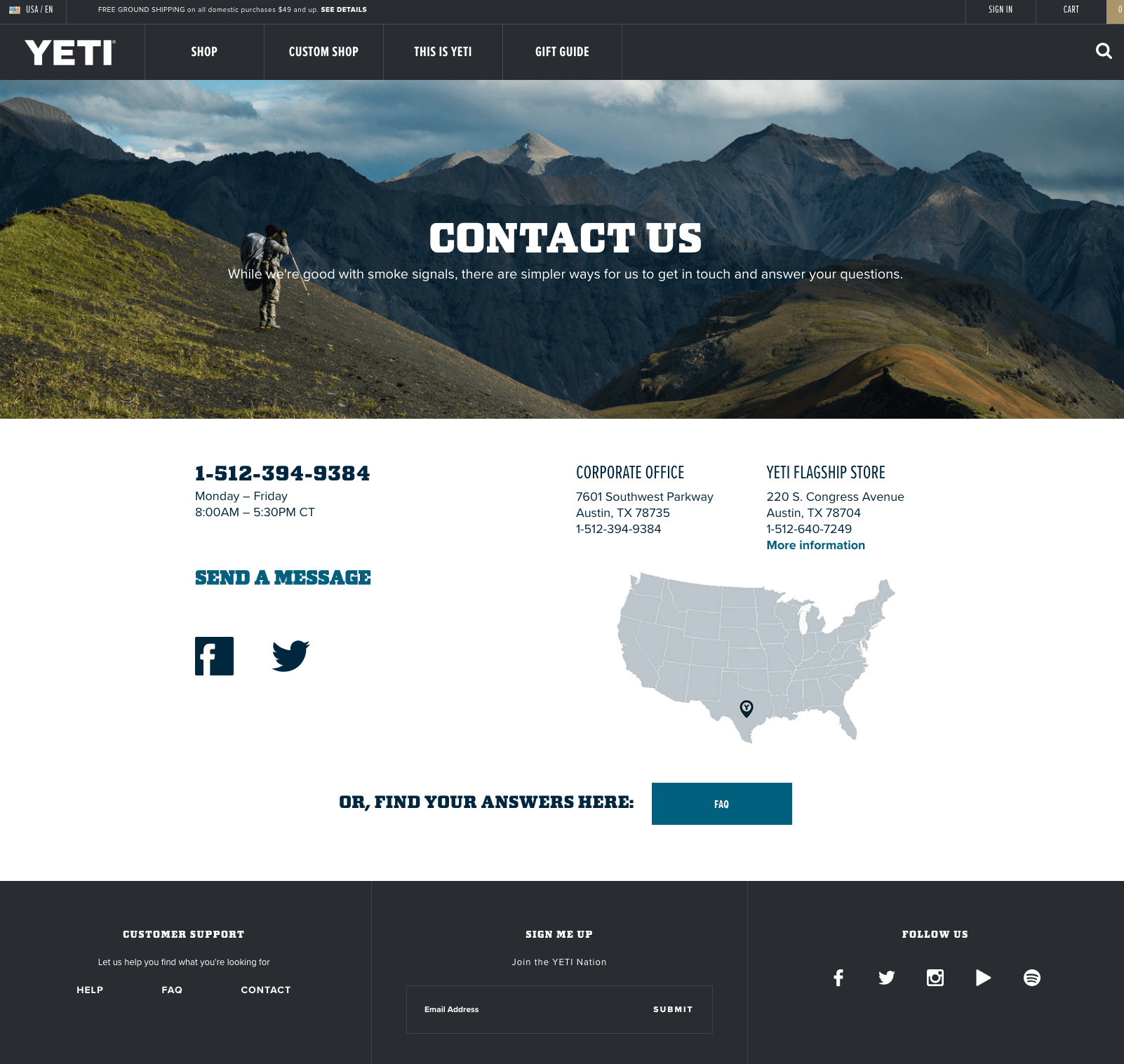
Yeti sells coolers and drinkware that are built for the great outdoors, and its 'Contact Us' page maintains the cool, outdoorsy brand. I especially like the clever tagline encouraging visitors to reach out ("While we're good with smoke signals, there are simpler ways for us to get in touch and answer your questions.") and the multiple different ways to connect across platforms.
The beautiful image of a hiker in the mountains with a Yeti cooler is juxtaposed with a clean white background to make the contact information and CTAs clear for site visitors, and the link to Yeti's knowledge base helps them quickly and easily find answers if they don't want to wait around.
[View the full 'Contact Us' page here.]
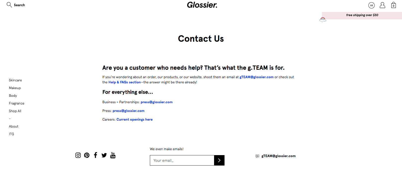
Skincare and makeup brand Glossier sells aesthetically-pleasing cosmetics in various containers of pink and white -- which is reflected on the website, too. The 'Contact Us' page is clean, simple, and easy-to-read, but its simplicity belies Glossier's secret weapon: the gTEAM, its customer service arm that responds to every single message and comment it receives via email or social media.
Glossier's 'Contact Us' page offers visitors a variety of different options for contacting the correct team, including its Help and FAQs section, and the web page makes it clear and simple to get the information you need.
[View the full 'Contact Us' page here.]
Moz, a Seattle-based SEO software company, features a bold and clear CTA on its 'Contact Us' page ...
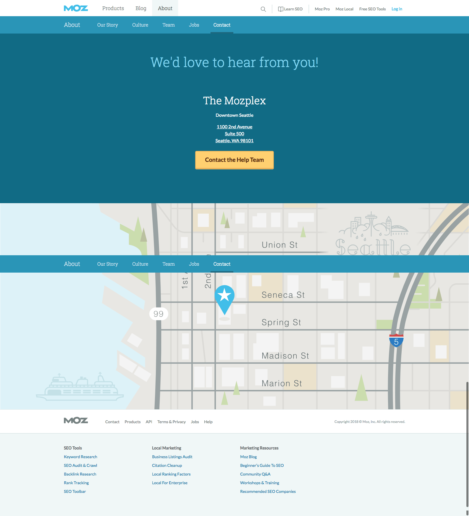
... which leads visitors to a more detailed 'Help Hub,' where visitors can click around to find the help they need for specific software or services Moz offers.
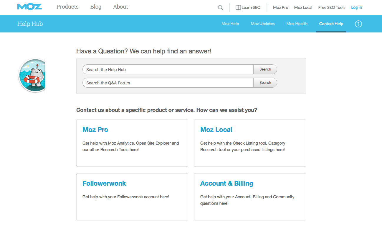
[View the full 'Contact Us' page here.]
With offerings as vast and multi-faceted as those of Moz, it's a smart idea not to overwhelm someone who needs help right off the bat. Instead, Moz provides the need-to-know contact information on its main 'Contact Us' page, with additional, more-detailed resources available once they click 'Contact the Help Team.' Plus, it features a neat map of Seattle showing exactly where Moz is for people coming to visit in-person.
Accenture offers professional services all around the globe (in 120 countries, to be exact), so suffice it to say, there are probably hundreds of different phone numbers and emails people could reach out to for help.
Luckily, this multinational corporation has figured out how to present a lot of information in a compact way on its 'Contact Us' page -- with expandable sections visitors can click into to get the information they need.
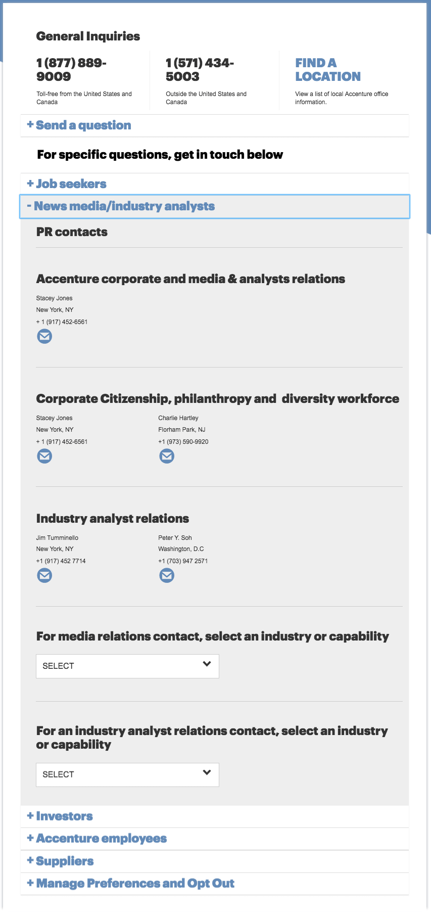
The 'Contact Us' page is actually chock-full of useful contact information for any request under the sun, but by organizing it in a compact way, Accenture prevents too much confusion while still giving the information needed.
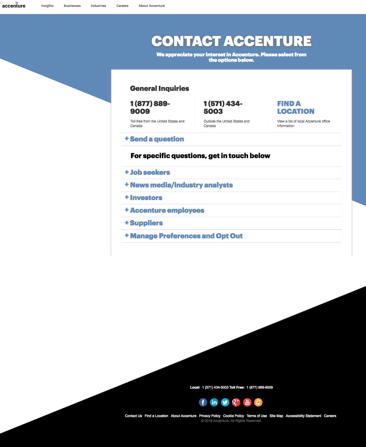
[View the full 'Contact Us' page here.]
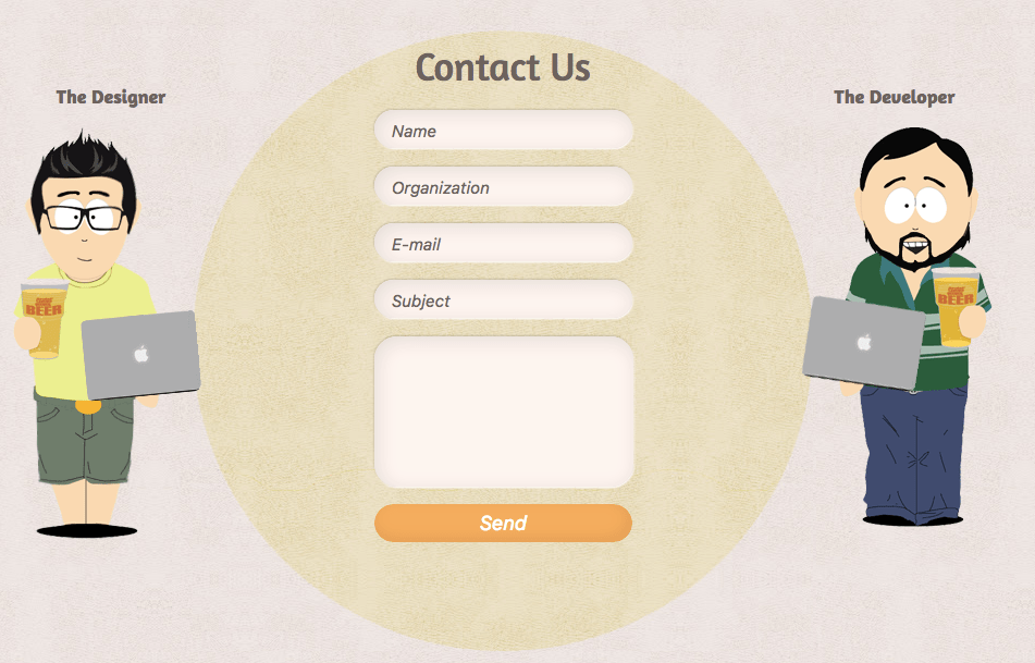
Melonfree, a Paraguayan web consulting agency, does just about everything under the sun to build creative and beautiful websites. And while its homepage showcases its portfolio of interesting and eye-catching work, its 'Contact Us' page takes the cake for being the most creative.
If you're a "South Park" viewer, you immediately recognized the avatars of Melonfree's designer and developer. It made me laugh, especially when I saw the personal touches they added to showcase their personalities, and that emotional response makes a brand more memorable -- a connection that's integral to customer loyalty.
[View the full 'Contact Us' page here.]
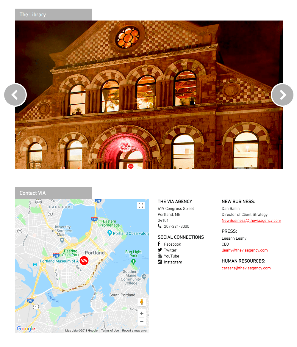
The VIA Agency, based in Portland, Maine, uses its website to showcase its slick interactive web work for a variety of big-name clients. So it's no surprise that its 'Contact Us' page features similarly high-tech web features, including parallax scrolling, and generally appealing images.
Its 'Contact Us' page shows visitors the beautiful building VIA operates in, and then it visualizes exactly where its office it alongside the contact information visitors need. It's beautiful, it's clear, and it provides the names and contact information of people visitors can reach out to directly as a bonus.
[View the full 'Contact Us' page here.]
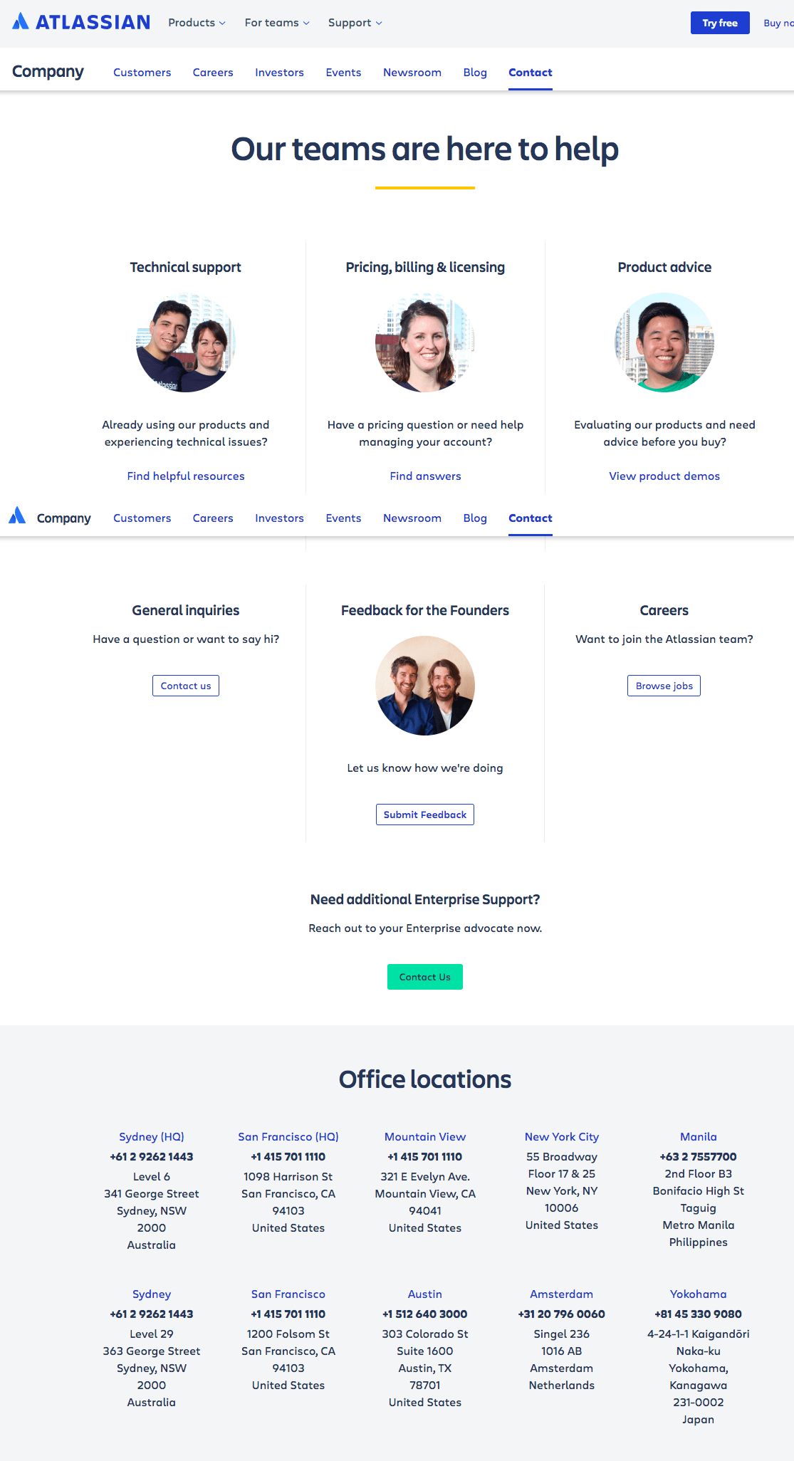
Enterprise software company Atlassian offers a ton of different products for large companies to use to stay organized. But despite that, its 'Contact Us' page is extremely well-organized and clear so visitors can easily sort through its website to find the help they need.
I particularly like the headshots showcasing the friendly-looking real people who are available to help, as well as the opportunity to submit feedback to Atlassian's founders front-and-center on the page. It shows a commitment to transparency and an openness to criticism that's refreshing -- in addition to sharing a wide variety of help documents, FAQs, and ways to contact the company.
[View the full 'Contact Us' page here.]
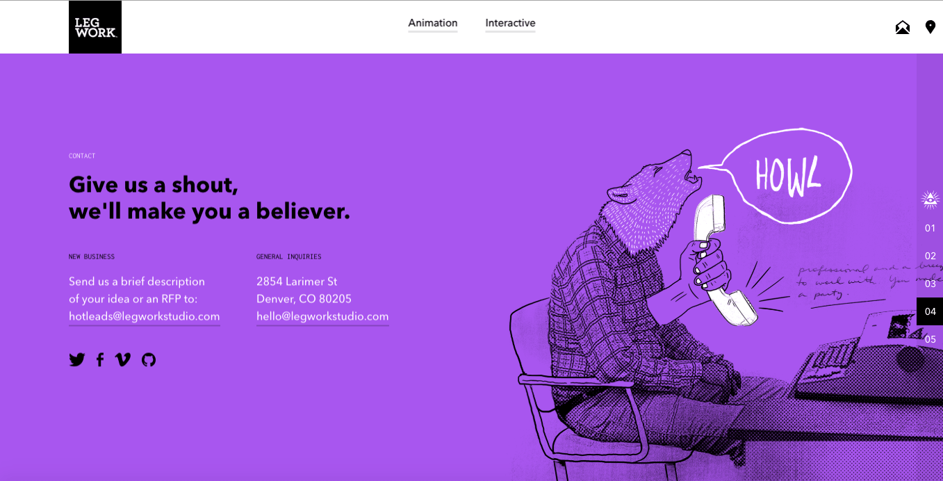
Legwork Studios is an animation and interactive design agency, and its website really speaks for itself. It features cool pencil-style drawings accompanied by eye-catching animations, and the clever website copy throughout keeps visitors engaged and chuckling -- and reading more.
The 'Contact Us' page provides all of the necessary details to get in touch with Legwork, and it features a bear dressed in business casual, hard at work at his typewriter. It's quirky and memorable, and it shows off their skills to boot.
Another fun detail I noticed while writing this blog post: The longer you stay on Legwork's 'Contact Us' page, the micro-copy of the page keeps changing on the tab of your web browser to attract your attention with more funny one-liners, like "Do you love me?" and "I know what you're thinkin'" and "What about the boat times?" and "I want to show you something." I don't exactly know what they mean, but the flashing caught my eye and made me click back onto the page -- an effective way to get someone's attention if they were, perhaps, reviewing a few different companies' websites at a time.
[View the full 'Contact Us' page here.]
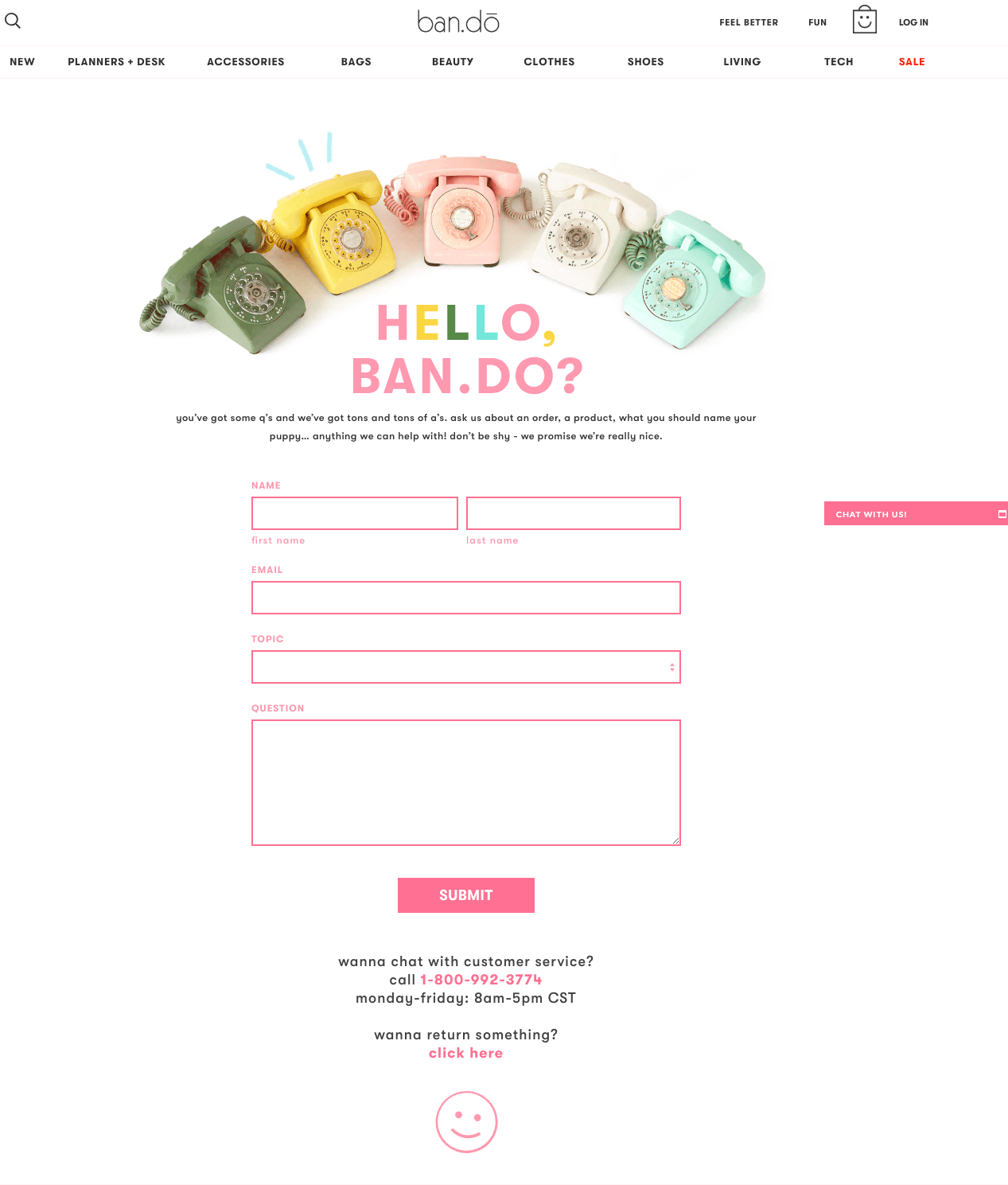
ban.do sells whimsical and creative planners, notebooks, and other accessories, and its entire website reflects its brand style with fun fonts, bright colors, and interesting animations to keep things fun.
Its 'Contact Us' page features an animation of old-fashioned, colorful phones "ringing," lots of bright pink, clever and casual web copy, and all of the information a visitor on this page might need. From one page, you can get in touch with ban.do, contact customer service, and get information about returning a product.
It's important for every page of your website -- including the 'Contact Us' page -- to reflect the brand, and this page does a great job of keeping things fun while helping ban.do's customers.
[View the full 'Contact Us' page here.]
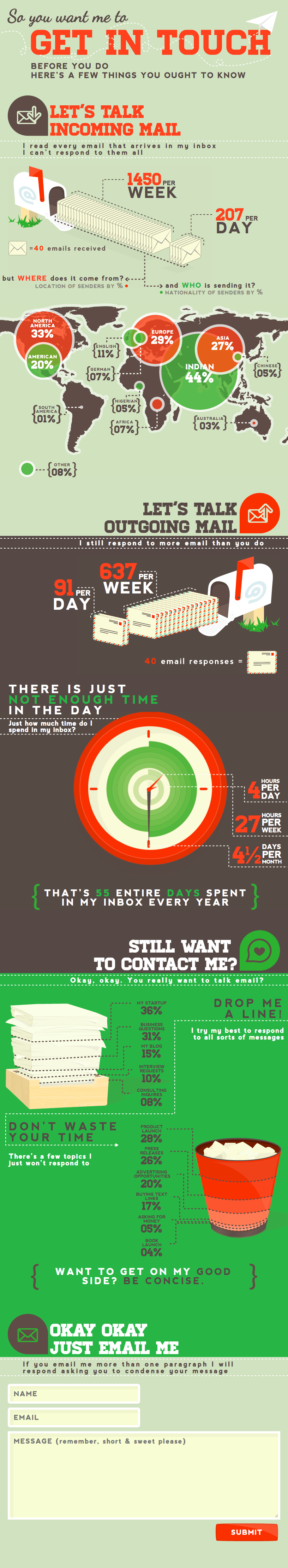
Quick Sprout's 'Contact Us' page is far from traditional -- it actually features an infographic. It's a clever way to showcase the kind of work you can do with Quick Sprout, and it takes visitors on an interesting journey to learn more about the company and the best way to get in touch.
The infographic helpfully shares information about the best way to get in touch -- including the topics least likely to garner a response, and how short to make the email to get a better reply. It's unique, helpful, and memorable -- a win, win, win.
[View the full 'Contact Us' page here.]
When you first navigate to Medium's 'Contact Us' page, you see a quirky custom illustration that is one of the hallmark's of Medium's minimalist website with an emphasis on whitespace.
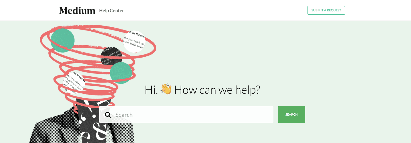
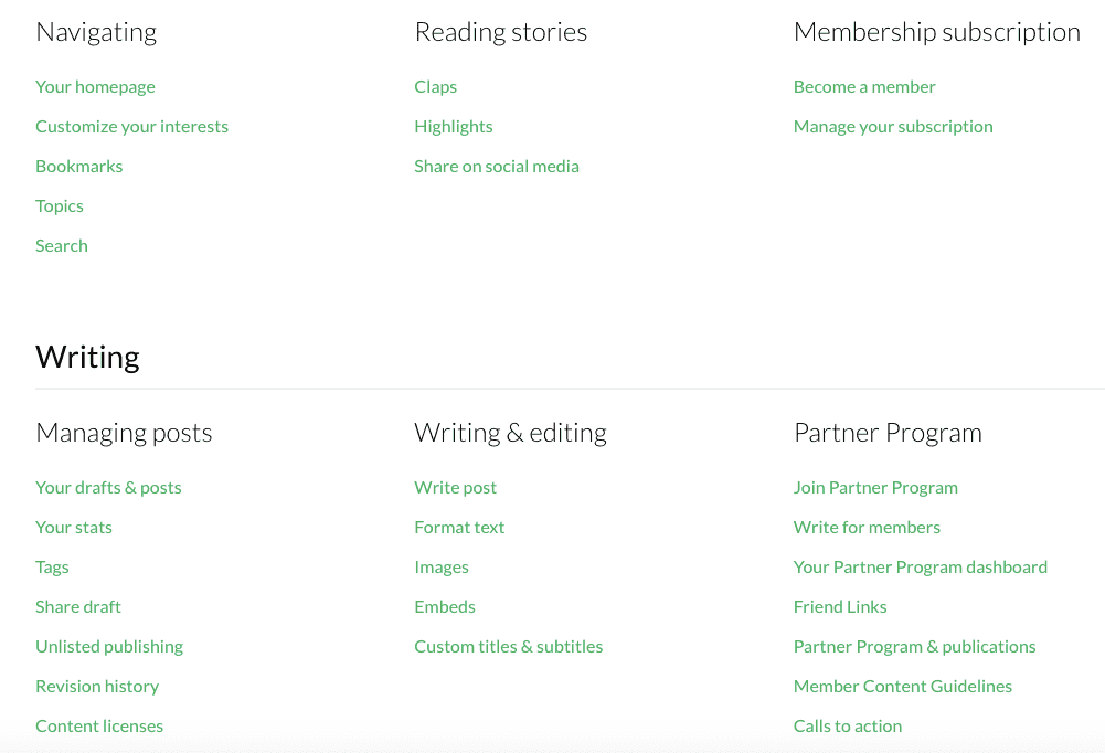
Visitors have the option to type in a topic or submit a request -- or, if they keep scrolling, they'll find Medium's helpfully curated list of knowledge base articles and forums to peruse.
[View the full 'Contact Us' page here.]
It's a clever idea to combine your 'Contact Us' page with your knowledge base. That way, on one page, your users and customers can effectively navigate questions and concerns, or reach out, all in one place.
So there you have it: a list of some of the best 'Contact Us' pages out there. Take a look at your business' contact page and see how it stacks up -- or if there are any changes you can make to give your site visitors a better, easier, and more enjoyable experience.
To learn more, read the top customer service books we recommend next.

Originally published Sep 11, 2018 2:06:00 PM, updated September 11 2018